
Crisp Icons + Graphics in Squarespace with CSS
You may have noticed when adding icons or graphics to your Squarespace 7.0 or 7.1 website, especially PNG images, that they are not always as crisp or clear as you’d like them to be. It can also be difficult to control the size of the graphic on the mobile version of your site using the built-in image block with spacers.
If your icons or graphics look blurry or out-of-focus on your Squarespace website, this simple CSS tutorial can help you to make them sharp, clear, and crisp. This method for how to add sharp icons to your Squarespace website using the custom CSS panel will also help you control the size when viewing the mobile version of your site without using spacer blocks.
This tutorial works for adding crisp icons or graphics to your Squarespace 7.0 or 7.1 website.
This post may contain affiliate links. That means if you click and sign up for the service, I may receive a small commission. This does not create any additional cost to you.
Before I get into just how to resize your icons and make them sharp in Squarespace, did you know that you can use Canva Pro (yup, that’s an affiliate link) to create the image file in the proper upload size? Canva Pro is a great alternative to professional design software that is great for creating all the images your brand and website needs without the price tag of the pro software.
How to Add Sharp Icons to your Squarespace 7.0 or 7.1 Website
This tutorial has 3 simple steps to get rid of fuzzy icons or graphics on your website and make them easier to size for mobile.
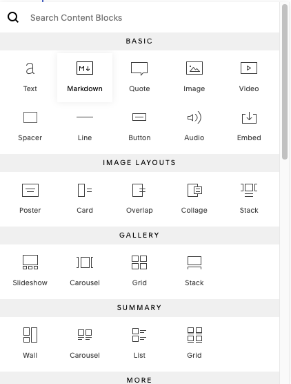
Step 1 - Add a markdown or code block
Instead of using an image block to add your icon onto the page, we’ll be using a bit of code with either a markdown block or a code block. Keep in mind that a code block is a premium feature, so you’ll have to be on one of the business plans to use a code block. From this point on I’ll just say markdown block to keep things simple.
In edit mode, click an insertion point on your page and select markdown block from the options that pop up.
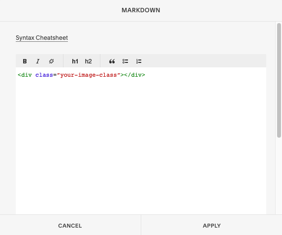
Paste this code into the markdown block:
<div class=”your-image-class”></div>
Change your-image-class to something that makes sense for your image the hit apply.
Step 2 - Upload your Icon or Graphic to Squarespace using Manage Custom Files
Navigate to the Design settings > Custom CSS
Scroll all the way down until you see the button “Manage Custom Files,” and click on it to open it up.
Click on the upload arrow that says “Add images or fonts,” to add an image file from your computer or external drive. Or, you can drag and drop the image into the panel if you already have it handy.

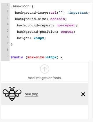
Step 3 - Add Code to the Custom CSS Panel
Add this code to the custom CSS panel:
.your-image-class {
background-image:url("your-image-url") !important;
background-size: contain;
background-repeat: no-repeat;
background-position: center;
width: 200px;}
Place your cursor inside the quotations where it says your-image-url and delete that text. Keep your cursor between the quotes. Don’t delete the quotes, you need them for the code to work.Once again, open up “Manage Custom Files” by clicking on the button below the CSS code injection window.
Click on the icon that you uploaded.
The URL of your image will be added between the quotes.
Now you can adjust the size of the icon on the page by changing the pixel height*. This is the same height it will be on mobile as well.
* Alternatively you could use width, but for this tutorial I used height.
Sizing Icons on Squarespace for Mobile without Spacer Blocks
With the above method, there is no need to use spacer blocks to size your icons for mobile.
Using spacer blocks can produce the image size you desire for your website on desktop, but you’ll notice that on mobile, your image will expand to fit the width of the mobile window.
If the size of your icon is still too large for mobile after using the method above. You can add a very simple media query to adjust the icon size for smaller screens.
Here is a bit of example code* that you can use to make your icon smaller for mobile:
@media (max-width:640px) {
.your-image-class {
height:100px; }}
*Make a note of the double closing brackets. With Media queries, there are two opening brackets and two closing brackets. Leaving one out, may break other code on your site, or just cause this bit not to work.
This media query, using max-width, tells the browser: use this code whenever the browser size is equal to, or less than this number of pixels.
And, there you have it! 3 simple steps to creating sharper icons and graphics on Squarespace that resize nicely for mobile, without using spacer blocks.
Need help building a custom website on Squarespace? 🙋♀️ Yup! I can help ya with that! Check out my Custom Website service and see if it’s right for you.
Don’t take off without snagging a copy of my Free Website Goals + Nav Workbook. This workbook will help you set clear goals for your website and navigation that will help you convert your site’s users into paying customers and clients!


