Everything You Should Know About Preparing Images for Squarespace
The images you add to your website can really help it to shine, which is why it is so important to make sure that they are the best they can be.
In this post, I’ll go over everything you need to know about preparing and saving images for your website, including best practices, and even how to name them for SEO (Search Engine Optimization).
This post may contain affiliate links. If you purchase using one of my links, I may receive a small commission.
This post is divided into three parts cover guidelines for maintaining a consistent style, recommended sizes, and best practices for saving and naming your images.
Guidelines for Staying
Consistent + On Brand
Staying consistent with the images on your site is just as important in building trust with your audience as consistency in your branding.
Here are 4 ways to maintain consistency across your web images:
1 Use Images from the Same Photographer or Edited in the Same Style
Photographers generally have a personal style and will edit all of their images in a similar fashion.
If you edit your own images, be sure to view them all together. This will make it easier to see any inconsistencies in editing. You’ll want your images to look like a family with no“black sheep.”
You can find photo collections from the same photographer on Creative Market
2 Keep Image Sizes + Ratios Consistent
For banners and other images on your site it is recommended to maintain a select number of sizes. If every image has a different size and aspect ratio (1:1, 3:4, 4:3, etc.), the site is going to look like a big hot mess. No one wants that!
It is best to choose just a few aspect ratios. Establish rules for your images and only break them when truly necessary and when it makes sense to do so.
3 Use All “Light” or All “Dark” Images for Banners
If your banner images will have text over them (which is more likely the case than not), it makes sense to choose all “light” or all “dark” toned images so that your site doesn’t require lots of custom code to change the text color.
Not only is this easier from a maintenance perspective, but also helps in maintaining consistency in your branding.
4 Keep Banner Images Minimal with Little Variation in Light + Dark
You’ve worked your tail off to write all of the copy for your site, especially the headlines. In order to make sure your site visitors can read all of that amazing content, keep banner images minimal and simple.
Busy images (images with a lot going on, and great variations in light and dark tones) will make your text difficult to read.
Resolution + Recommended Sizes
For Images on Squarespace
Sizing your images appropriately will help your website load faster for visitors and will also ensure that they are crisp, clear, and looking their best.
Here are 5 areas to pay attention to when you size your web images:
1 Image Resolution + File Size
Images sized for web, or other digital uses, should be 72 ppi (pixels per inch) and no more than 500kb (that’s kilobytes) in file size. No, your screen isn’t measured in inches, however, this is the common terminology you should get acquainted with if you are sizing your own images.
2 Squarespace Banner Images
For Squarespace, it is recommended to make your images around 2000px wide and between 1000-1800px high depending on how they will be used. If your site will use parallax scrolling (that is when more of the image is revealed as you scroll past it), it is recommended to have a taller image.
3 Half-Page Images
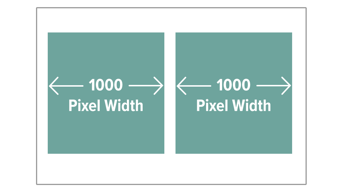
Images that only cover half the width of your site can be sized to 1000px width. Your image height will depend on the aspect ratio you’re using.
4 Smaller Graphics
A good rule to remember is 2000px = 100% width. If for instance, you need an image that only spans 25% of the page, it can be 500px wide. It is best not to make images unnecessarily large. Smaller images will have smaller file sizes. The smaller the file size, the faster your site will load, and search engines prefer sites that load quickly.
If math is really not your thing, here is a nifty cross multiplication calculator. Unlike math, however, sizing your images does not have to be an exact science. In general, the smaller the area it will take up on your site, the smaller the image can be saved.
5 Icons + Graphics
Icons and vector graphic elements seem to be the only exception to the rules. For crisp and clear images it is recommended to make them between 1000-1500px wide, even though they will not be used this large on your site.
Icons and graphics should also have a transparent background (unless they will be used against a white or solid color). This means that they will need to be saved as PNG instead of JPEG in order to preserve transparency settings.
Saving Images for the Web
There are a few things to pay attention to when saving images for the web.
Choosing the right file type isn’t hard if you know the basics, and naming your images descriptively will help search engines locate your images.
PNG vs. JPEG (or JPG)
In general, PNG is better for icons and vector graphics with few colors and will yield a smaller file than JPEG for this type of image. JPEG is better for photographic images with many colors, and the file size will be smaller than if you were to save as PNG.
If you need transparency however, PNG will be required as JPEGs do not support transparency. In the case that you have a photograph, and desire that a portion is transparent, a PNG will be needed.
It is almost always recommended to save a photographic image as JPEG, and an icon or graphic that has few colors as PNG. There are of course always exceptions to this rule, so if it comes to a scenario where you aren’t sure which option to choose, I recommend saving the file both ways and seeing which file is smaller. Experimentation is completely normal. Don’t be frustrated if you don’t know the right file type to choose every time. Even experienced designers will need to experiment sometimes to choose the best file type. :)
Recommended File Size
I’ve mentioned a few times (I’m sure I’m starting to sound like a broken record) that you want to save your images with the smallest file size (in kb) possible without reducing image quality.
A good rule of thumb is to keep images under 500kb. However, if you can go smaller, without reducing quality, DO IT!
Keeping image files as small as possible isn’t just to help your site load faster, though a fast site is certainly more appealing to visitors, nobody likes waiting for content to load, and I mean nobody! Improving the speed of your website also gets you points with Google and other search engines, who are trying to deliver the best results possible to their users. Search engines will therefore prioritize a faster site over a slower one when delivering search results.
If you are having trouble getting images under 500kb, here are a few things you can try:
Reduce image quality slightly to bring down file size, without making a noticeable change. If this is not an option in your image editor, you can alternatively reduce the width slightly.
Use an image compressor on the web, such as CloudPresso. This can be very handy when you need to get a large image down to size, but is also great for reducing the file size of any image on your site. Image compressors such as the one mentioned above, can be used to reduce image size without noticeably affecting image quality.
Naming Image Files For SEO
(Search Engine Optimization)
Last, but definitely not least, is naming your images descriptively so that search engines may find them. Search engines will not actually “see” your images, they rely solely on your descriptions to know what they contain.
Image names should accurately describe the content of an image
Use SEO keywords when possible, but only if they pertain to the image directly. While it might be tempting to add as many of your website keywords as you can, be aware that google and other search engines are savvy to this trick, and it could end up hurting your SEO performance rather than helping.
You can update your image file names in Squarespace after they are uploaded to yoursite, however best practice is to name them before uploading. This way you don’t miss any, and it helps you stay organized.
Example: Cactuses-blue-sky-desert-landscape-baja-california-mexico.jpeg
Squarespace Web Image
Best Practices Recap
Keep a consistent look and feel among your images.
Banner images should be around 2000px wide, 1000px for half width, etc. for best quality.
Icons can be larger for clarity, around 1000-1500px wide.
Keep all images under 500kb for faster loading times.
Choose PNG or JPEG based on image content. Remember that PNG supports transparency and JPEG does not.
Optimize file sizes and descriptions for SEO.
Have any questions? Did I miss anything? Leave me a comment and let me know if this helped you!
Not quite ready for a custom site but you want to get crystal clear on your website goals and create intuitive and easy to use navigation in a snap?
Snag my Website Goals + Nav workbook for free! It is a step by step process for creating highly usable website navigation that is directly tied to your goals.


