4 Tricks to Using Spacer Blocks in Squarespace that will Make your Website Look More Professional
The spacer block in Squarespace is possibly one of the most under-appreciated blocks. This simple block can have a huge impact on the look of your Squarespace website. In this post, I’ll show you 4 ways how to use the spacer block effectively to make your website look more professional and less DIY. Learn how to use the spacer block to create custom column layouts, and how spacer blocks work on mobile.
Trick #1: Adding White Space with the Spacer Block
The telltale sign of a DIY website? Not. Enough. White space.
“What is white space,” you ask? White space is simply negative space in your design that is not taken up with busy images and text. It doesn’t have to be white.
We use this negative space around important content to help direct our visitor’s attention to the particular thing we want them to see or read.
Here are two websites to illustrate the concept of white space.
The first design, as you can see, has their information-packed closely together. It’s not evident what content this website wants us to look at first. It is actually a bit of a fight for the brain to settle on which text to read first.
The second example, however, is uncluttered. The design uses ample white space to direct our attention to the main headline and CTAs (calls to action).
Adding white space to your Squarespace designs is the number one thing that can take your website from looking DIY to looking stellar and professional.
Try this! Experiment with adding spacer blocks above and below content within page sections. You can also add spacers to the left and right, avoiding text blocks that span the entire width of the page. This will make your text much easier to read as well.
Example of not having enough negative space.
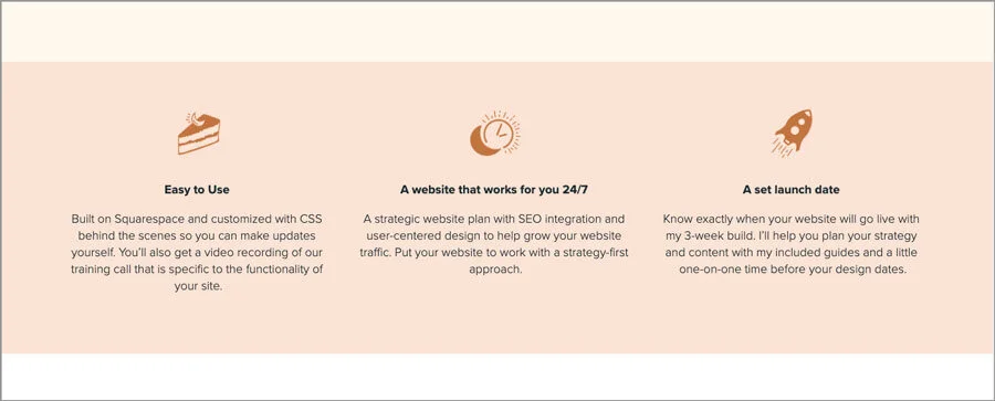
Example with proper negative space added.
Example of placing spacer blocks to the left and right of text blocks.
Trick #2: Adding Spacer Blocks to Banner Images
Just like other content on your website, banner images look better when they aren’t smushed into the page. Give the text and image room to breathe.
Depending on what Squarespace 7.0 template you’re working in, you may either add spacer blocks to your banner images (Brine family templates allow this, and possibly a few others), or you may need to adjust spacing above and below content in the Style Editor.
Squarespace 7.1 templates all allow the same functionality, and adding spacer blocks to banner images is allowed. Keep in mind though, that on 7.1, those spacers disappear on mobile. Check out trick #4, for adding space back into your 7.1 mobile website.
Check out two versions of this banner with the exact same content.
The first one doesn’t use any spacer blocks, and the second uses a few spacers above and below the content. Which do you think looks better?
If you are working in a Squarespace 7.0 template that doesn’t allow spacer blocks on top of banner images. Navigate to Design > Site Styles, and click on your banner image. Scroll down to the section named “Index: Page” and adjust the pixel slider for “Padding (Overlay Pages)” in order to achieve the space you need.
Trick #3: Create Custom Column Layouts with the Spacer Block
Adding white space to your Squarespace website with spacer blocks is important for creating that professional look you want, but spacer blocks are capable of so much more.
The spacer block is simple but mighty. You can use spacer blocks to create custom grid layouts in Squarespace.
Squarespace is based on a 12-column grid system. What does this mean? Well, it means that in order to have equal columns, the number of columns must be divisible by 12.
So, 2, 3, 4, 6, or of course 12 equal-width columns are possible, though those 12 columns would be pretty dang skinny. I don’t recommend a 12 column layout!
Here are a few other layouts that are possible, though there are many more.
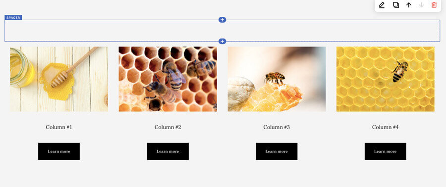
Take a look at the example below. I’ve added 4 spacer blocks and placed them all next to each other in order to create 4 equal columns.
Now I can place my content directly under each spacer block.
Once I’ve added in my content, I can go ahead and delete the spacer blocks as I was only using them to create the 4 columns I wanted. If I still need space above or below my column layout, I’ll add a full-width spacer block. You’ll see why this is important in the next section.
Trick #4: How Spacer Blocks Appear on Mobile
Squarespace automatically makes adjustments to the layout of your website when it’s viewed in a smaller browser window like on tablets or phones.
If you’ve set up your column layout as described above, then the content within each column will stay together. Perfect, that is what we want.
If you’ve set it up another way, you may see your content appear in the incorrect order on mobile. Before you make any mobile-specific changes to your site, you’ll want to get that sorted out first.
It’s important to know that some spacer blocks are hidden when your Squarespace 7.0 or 7.1 website is viewed on mobile. On tablet view, the columns and spacers will remain intact and get smaller.
Any spacers you have placed next to each other horizontally on your site will be hidden on mobile. Why is this important?
Well, if you created a 4 column layout and didn’t delete the 4 spacers above each column, they will be adding extra space above your columns on desktop and tablet, but when you view your site on mobile, that spacing will disappear.
If you wish to maintain that spacing on mobile, then what you’ll want to do on your 7.0 site is delete the 4 spacers that you used to set up your column layout and add just one spacer block above the column layout which spans the width of your page.
If you are on Squarespace 7.1, you’ll need to use a little bit of custom CSS to keep the spacer blocks visible. This way you can actually choose exactly which spacers you want to keep.
On 7.1, navigate to Design > Custom CSS and add the following code to unhide all of the spacer blocks on the mobile version of your site.
.spacer-block {
display: block !important;
}
If you want to target spacer blocks in just one section, you’ll need to add the section ID to the beginning of this. That is a bit too involved for this tutorial, but stay tuned, I’ll release a post on targeting sections in a future blog post.
In the meantime, you can use this nifty Chrome plug-in to locate the section ID # in Squarespace 7.1.
If you want to target 1 specific spacer block, then use the block ID. You can use the same plug-in to find that too. If you don’t use Chrome, you’ll need to inspect the code to locate those ID numbers.
To target one specific spacer use this code:
div#block-yui_3_17_2_1_1587735614716_5255 {
display: block !important;
}
You’ll of course replace the example block ID above with your own.
Well, that’s a wrap!
Did this post help you? Or do you still have questions? Please leave a comment and let me know! I’m always happy to hear from you!
Need help building a custom website on Squarespace? 🙋♀️ Yup! I can help ya with that! Check out my Custom Website service and see if it’s right for you.
Don’t take off without snagging a copy of my Free Website Goals + Nav Workbook. This workbook will help you set clear goals for your website and navigation that will help you convert your site’s users into paying customers and clients!


