How to Move the Add to Cart Button Above the Product Description in Squarespace
If you’ve got an online store in Squarespace 7.0 or 7.1, you may have wondered - how do I move the add to cart button above the product description? This seemingly simple task isn't quite as straightforward as you might think, especially if you haven’t spent much time in the style editor.
For long product descriptions, the default in Squarespace is that the add to cart button appears below the product description. That might mean that it is wayyyyy down the page. Not ideal for many scenarios.
In this post, I’ll show you a zero-code solution to quickly move the add to cart button above the product description to give it more visibility for your site visitors.
Default Add-to-Cart Button Position
By default, Squarespace places the Add-to-Cart button below the product description. If you’ve got lengthy product description text, this may not be ideal for your site.
Your first thought might be “can I move the add-to-cart button without using code? Well… yes and kinda no. but you can achieve the look you want without code. Stay with me friend, I’ve got your back.
You may have missed the option in the style editor for a couple of reasons. First, in order to place the add-to-cart button underneath the product description, you’ll actually need to move the description, not the button. Second, product “description” is referred to as “excerpt” in the style editor.
Enough of the nitty gritty, let’s head over to the style editor to see how it’s done.
Move the Add-to-Cart button Above Product Description in Squarespace 7.0 + 7.1
You’ll want to have one of your product pages open when you navigate over to the style editor so that you can see the changes you’ll be making.
Here’s What You’ll Do:
Step One
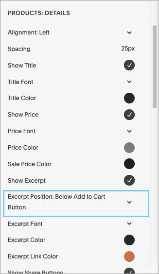
Click on the entire product description section to select it. You’ll see a light blue line appear around it. This includes the title, price, quantity (if you have it), the add-to-cart button, and the description.
If you select the Add to Cart button itself, you will not see the styles you need to change pop up on the left panel.
Step Two
In the style editor panel to the left, you’ll see a whole bunch of options. The one you’re looking for is “Excerpt Position.”
Step Three
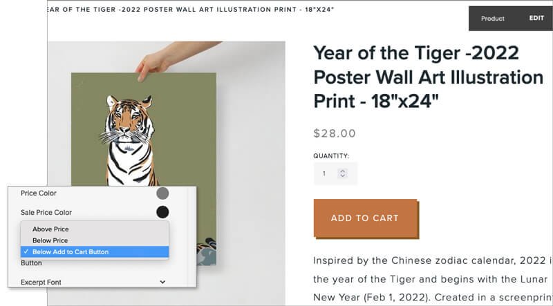
Click on the arrow to the right of “Excerpt Position” and you’ll have three options: Above Price, Below Price, or Below Add to Cart Button. In order to get the look in the below image you’ll select the last option: Below Add to Cart Button.
Step Four
Once you select the choice you want, you’ll be able to see that change right away.*
Don’t forget to hit the save button in the upper left corner before you navigate back to another menu.
*If you don’t see the change, try refreshing your page.
And that’s all she wrote my dear friends… until next time.
Do you need help creating a stunning and custom Squarespace website? Check out my process to see if it’s right for your mindful business.


